
Checkplis
Challenge
To create a streamlined, intuitive, and smartly-designed on-boarding experience within the Checkplis app to enhance the user experience. In addition, provide a redesign of the current app where necessary.
Solution
Improve on-boarding process with more detailed images and clearer instructions. Redesign current app to be more intuitive and build trust to new customers while maintaining the brand’s look and feel.
result
A redesign of the current app including the on-boarding experience and QR code placards that better communicates and shows the Checkplis process, experience, and legitimacy to new customers.
project details

The client
Founded in 2018, Checkplis is a mobile app integrated into the restaurant POS system so customers can pay, tip and split the check from their phones.
My role
As a UX designer I performed research, conducted interviews and research synthesis, performed usability tests, designed wireframes and created a hi-fi prototype.
Tools
Sketch app, InVision, Whimsical, post-it’s, pen and paper, whiteboard and Google Suite
Overview
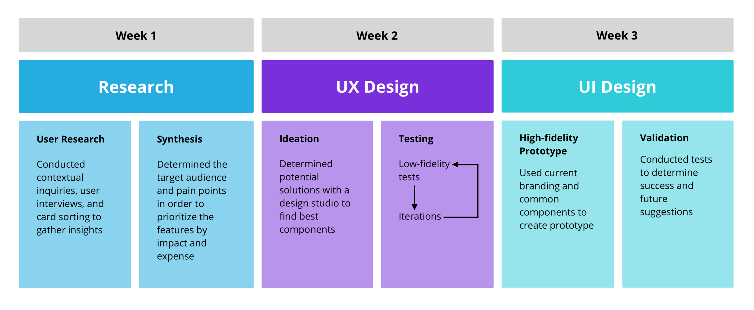
Research
Contextual Inquiry
I took 5 people to Clutch, a restaurant in Venice, CA which uses the Checkplis app. I observed them in the restaurant environment while asking questions to gain insights. I learned that users didn’t know how to use the QR code with the app.
App interviews
In addition, I interviewed 14 people using the app from the on-boarding process through the confirmation page. This gave me thorough insights into the current issues with the app.
A/B Test
Due to my previous discovery in our contextual inquiry, I had 7 people sort the original design of the QR placard with different versions that I designed by their preference. I then conducted an A/B test to find which card performed best.
Synthesis
Affinity map
I was able to see common trends with the users pain points from our affinity map. I calculated how many times users stated the problem to identify the top issues for our client.
Persona
To help me define who Checkplis is for, I created a persona named Bianca. I referenced Bianca throughout the UX phase to understand how my design decisions would best help the user.

Journey Map
Bianca’s journey map allowed me to visually represent the users experience with the Checkplis app.
Her major paints points:
Confusion about the QR code placard
Confusion with the home screen
Uncertainty with how to tip
This resulted in her deleting her info due to lack of trust.
feature prioritization
I prioritized our issues by impact and expense to help us narrow my focus for design.
Priorities:
Redesign of QR code placard
Redesign of the home button
Create an intuitive tip screen
Improve on-boarding screens
Ability to split a single item
Ideation
Scenario
Bianca is out for lunch at a trendy new restaurant with some co-workers. She wants to focus on the dining experience and also quickly split and pay the bill afterwards without any confusion.
Design studio
Keeping our scenario in mind, each member of our team designed possible solutions. After sharing our individual ideas, we combined all the best elements to create the look and feel of each re-designed page on the app.

Testing

Usability Testing
I conducted a total of 9 usability tests. Testing in medium fidelity allowed me to save time and incorporate valuable feedback before adding in high level details like color and font.
Iterations
I found that users wanted
Streamlined account process
A more inviting home page
Clarification on bill total v. their personal total
QR code testing
I conducted 7 tests on the QR code. I tested several different versions of the QR placards that we designed with the original design (shown in the picture) to understand what would alleviate users confusion.
QR code findings
Through testing the QR code placards I found that users wanted:
To know what or who the placard is for
Where the QR code would take them
Directions on what they are supposed to do
Something to draw their attention

Original QR code placard
Solution
QR Placard
To alleviate confusion with QR code I recreated the QR placard to include a clear purpose and directions for users to follow. I also included the Checkplis logo to help people associate themselves with the brand. Considering the clients needs, I also had to incorporate the restaurants logo.
On-boarding
To improve the on-boarding process I put higher quality photos and more detailed instructions to better communicate the process.
Home screen
Users thought the finger logo in the original home screen was a shutter button. They also felt the scan frame was disorienting when you first open the app.
My solution was to redesign the home page to start with the feed, similar to other social apps, while providing a button at the bottom to scan the QR code when you’re ready.
Payment process
I allowed users to see who had picked up the bill at the table before selecting their items. I also allowed users to split a single item by both selecting it.
Users didn’t know the smiley faces were for selecting their tip and stated they wanted an option for a customized tip. So I took away the smiley faces and provided a clear tip section that users can easily understand with the option for a customized tip.

Success Page
The original design had users leave a review before submitting their payment. I switched this process by providing the confirmation page first, giving users the option to leave a review. I also provided more information on this page to build trust.
review page
I made an easier and more fun way to leave a review that was legible. I allowed users a simple one touch option to sum up their experience if they don’t want to take the time to write anything. They have the option to select more than one tag and the option for privacy.
final prototype
Task
You are at Clutch, a casual and hip BBQ restaurant, in Venice, CA with a friend for dinner. You are using a bill pay app called Checkplis for the first time and have already downloaded the app. Using the app, pick up your bill, pay for your items (you are splitting a BBQ sampler and paying for your glass of wine) and then write a review for your friends.
Suggested next steps
Conduct research on restaurant owners to eliminate their points of friction and onboard more restaurants
Implement social and privacy features to the app so that users can find and connect with, but also choose who to share with
Implement new QR placards so that users understand the purpose fo the card and become familiar with the Checkplis brand
Develop the app for the Android platform to capture more of the user market
View full prototype above
Conclusion
I delivered a high-fidelity prototype to the client, along with future recommendations. He was excited to see the results and is currently implementing the changes into the app.
What i learned
The user experience exists outside of the digital space. So, it’s important to be able to see the bigger picture by considering the physical space around it to make improvements.
Plan for the unexpected. Having to do additional research on the QR placards and additional interviews requested by our client set us behind schedule, but thanks to the teams hard work we were able to accomplish more than we planned for by our deadline.
To learn more about the project, contact me at paigebennett.ux@gmail.com